In this article, I want to document some tips and tricks I employ to make sure my house stays clean, more often than not. Why do I feel the need to write such an article? Because I think the default state, especially when you live alone, is to not care much about your house feeling like a dumpster. Also, thanks to our very adaptive minds, one quicky gets used to whatever surrounding they’re put into. And if I go down that route in the future, I’ll need something to spring back.
The other question is why I feel qualified to write about such a topic? I think that I’ve come a long way from my little flat that I rented towards the end of 2017, to jumping between several flats in Berlin and then learning some important aspects of living solo, many of them the hard way. Depending on your current circumstances, this article might seem off topic or too basic. Two years ago I would have found this article to be irrelevant as I was living with my parents and our house would clean itself (or so I thought).
Okay, so without further delay, let’s jump right into the guide.
Put things back when you’re done using them
In very simple words, whenever you take something out of its place, put it back after using it. That implicitly also means that everything has to have a place in the house (and if it doesn’t, check if you even need that thing). Just having everything in its place already makes a huge difference to how organized the house looks.
The best part here is that you don’t have to find extra time to do this. Just use any buffer time you find in between tasks to organize stuff. For example, when I’m waiting for stuff to cook on the stove, I put away all the cutting boards, knifes and spice bottles back to their places so that when I’m ready to eat, it is just the pot of food and my dishes out on the kitchen top.
Don’t leave dirty utensils in the sink overnight
It essentially takes the exact same time to either wash your dishes at night or in the morning. But the great feeling to see a clean empty sink in the morning is well worth pushing yourself to do the dishes before you go to bed. As an added bonus, your house stinks less over time.
Prevent, don’t just cure
Or in other words, don’t wait for dust to become visible on the shelves and fridge to stink before you start to think about doing something about it. Just like you wouldn’t wait to drink water up until your kidney hurts, make a cleaning schedule and stick to it irrespective of how unclean you felt on the particular day you planned to vacuum.
I prefer doing it in the first half of Saturday so that it feels like I have a shiny house for most part of the weekend.
Use the inertia to your advantage
The bad news is that if you get used to keeping your house just a notch above a hygiene meltdown, it will want to stay there and getting it back to normal would require significant effort (and probably a third party professional cleanup if you’re particularly good at not bothering with cleanliness).
The good news, similarly, is that if you keep it clean all the time, you’ll notice that if you skip cleaning a particular week (say you were travelling or just too tired), it wouldn’t feel terrible because the house is virtually just as clean. That’s just things wanting to stay the way they are, and it is easy to see how we can use it to our advantage.
Have visitors
When everything else fails, there’s this external motivator that works like a charm. Have people visit you from time to time. Bonus points if you have people who’ll visit you without or with very short notice. That way you’ll be forced to keep your house clean just out of the fear of embarrassment if nothing else.
Get motivated from within
I know, this one’s the hardest. But think about it this way: Why do people like going to the gym and working out? Or eating salads? Or studying? It is because they want to achieve the goal so desperately that they’re willing to put up with some hardships, that too with a smiling face. I feel like that’s the same with many things, including this one. You clean reguarly, not because you’re super fond of vacuuming the carpet, but because you like sitting on the couch on a saturday evening with the lights dimmed, chill music playing and everything smelling like a flower garden.
In closing
I hope that was informative. Caring for my place has made a huge difference to how homely I feel in this new city. No matter how tiring the day is, there’s always this one place, the place, where I can go at the end of the day and zone out of everything.
A question popped up recently in my office from our content team: What are the web development trends for 2020? It was directed towards us, the dev team, as it was assumed we might know a thing or two on this topic. We did suggest a few things here and there, but to me that spawned a deeper thought on what are the ‘trends’, if I may, that I’ve seen in professional web development that I personally care about.
An alternate and more appropriate (and perhaps a tad less clickbait-y) title for this post would’ve been…
What web developers actually talk about?
And I’d only talk about web developers for now, because one: that’s the people I spend a lot of time with, and two: the stuff we usually talk about hardly ever makes it to a magazine article listing trends. So, without further ado, let’s get right into it.
Talks about ethics in tech
Ethics, especially in tech, is part of every other conversation that we have. Many engineers I work with, and many I’m friends with care deeply about doing things right (with each of us having our own definition of what that means). I feel glad and fortunate to have such values driven people around me.
Cooking
We talk about cooking from time to time. We also cook good food sometimes, and sometimes mess things up. Food being such a basic necessity that it surprises no one that so many people have, at some points in their lives, taken cooking seriously.
Comics
A couple of us are also into comics. Reading, and sometimes even making. Most of us are very much into memes, but this is specifically about comics. They’re different, right? I think they are, but can’t explain how.
Clubbing
Back in college, my lack of exposure to many developers and the idealism of start years had led me to believe that developers hate doing anything that’s not to do with their computers and code. Clubbing and partying would’ve been the last things I’d have guessed a coder to do, but hey, we all learn.
Beer Making
That still does surprise me, but hey, why not?
Trying the new AWS stuff
Many of us are on our own side-learning quests. Someone is excited about learning Go while someone else is trying their hands on machine learning. We talk about it often, and share the material that we work with. Sometimes we even show each other code from our pet projects.
Native technologies
We often discus the new features that browsers ship, new paradigms that help better software development and make us better software developers. Frameworks come and go, but paradigms, patterns and best practices stay. ReactJS might not be here five years later, but separation of concerns might not become irrelevant anytime soon.
Web developers, especially the ones who work with JavaScript, know very well how volatile things can get, and having an idea of what is ephemeral and what not is critical.
Hiking
Hiking is something I got into because of my cousin. It is far less common back home than it is here in Europe. Here, many people around me frequently visit the nature and mountains. They bring back good stories from there, and one of my personal OKRs this year is going hiking. Let’s see how that goes.
Going back home to see friends & family
I work with many immigrants, and as such, there’s always the topic of going abck to see friends and family. The lucky Europeans do it multiple times a year, while the rest of us try to go back home at least once. We talk about how’s home, what we do when we’re there and if we’ll ever want to move back. It is quite surprising how similar it is for most of us.
Trying interesting food & travelling
Oh, the cliche. Like almost every other person, we are super into trying tasty food and travelling. We talk about new restaurants to try, and new places to explore. In fact, we take it very seriously, especially the lunch part. We bike to places around us and then join other groups from the office to try out new places. Honestly, I look forward to my lunch everyday at work.
In closing
Of course this article is written for fun. I know how stressful job hunting can be, and sometimes it is good to read the trends in web development to check if you’re going going completely tangent. As you can tell from this article, trends can mean different things for different people. For job seekers, it could be the stuff to learn to become more relevant, while for companies, it could be sticking to tools and technologies that make finding talent easier. For a developer in their day to day life, it could be, as you just read, something totally different. I hope it was fun reading this one. Until the next one then!
We entered a new year couple of weeks ago. I was a bit occupied with stuff around the new year’s time, but finally I can sit down and reflect upon how the last year went by for me. I’ll try to follow the same format as last year by writing what was good, what wasn’t, and my hopes for 2020. You can also check out 2019’s year review article.
In short
The start of this year was very busy given that I would be in India only for a week before setting out for Germany. There were a lot of feelings within me, all mixed together like the flavours in Bhel Puri. It wasn’t super comfortable knowing that I’m moving away from the comforts of home in a totally foreign country where I knew no one, and didn’t speak the language. Integrating in Germany was actually easier than what I had expected, and I think I was super lucky to find a good set of people around me. There was a lot of moving around in the city, travelling within Europe, meeting new people and making friends, trying all sorts of food and much more.
2019 was a busy year, but a very positive one in that. It was the year when I could understand a bit more about the kind of person I was, and the kind of people I like having around. I am genuinely thankful to all the people who touched my life this year. Following are a few highlights from the past year and TODOs for this one.
Highlights
No sick days, at work or otherwise.
Lost weight and got back into good health, started doing sports again and rode bike regularly.
Started learning German. Did A1, and that really changed my experience in Germany.
Did well socially, made sure I have no regrets when I think back about my start in this new world.
Got super comfortable with what I do professionally and got some clarity on the kind of professional expertise I’d like to develop in the long run.
Played board games, card games, chess, did karaoke, went to the lakes, biked 58kms in a day, lost my flight and luggage on the way to Berlin and many such memorable events.
Travelled solo to a number of neighboring cities and countries.
Realized my dream of turning a flat into my home with a lot of interesting customizations; warm and cozy with fairy lights, a good place to work, listen to music, read etc.
Became much more confident about the kind of person I am, and gained insights about how I react in certain situations, especially adverse ones.
Exchanged gifts with many people–friends and strangers–throughout the year. Learned the joys of giving.
#TODO in 2020
Try and eat healthier food, cook often. Prepare lunch for office?
Money management: Keep an eye on spending habits.
Make faster progress with learning the German language.
Read more.
Lower the time spent on social media / reddit / youtube.
Talk to even more people from around the world, get better socially and be a pleasant person.
Help, teach and mentor people. Share whatever knowledge and experience I have more actively.
Travel more than just superficially, explore by means other than air, go hiking.
Get a license, go driving on the autobahn and Nurburgring. Bonus +50XP Drive a BMW.
Other Random Thoughts
Since everyone is talking about us moving into a new decade, here are a few of my thoughts and reflections. 10 years ago I was in my 10th grade, preparing for that big SSC exam every adult had scared us students about. That was the last thing we had to work hard for before we soar high in the comforts of adulthood, we were told.
Alas, like many things we’re told as kids, that wasn’t true. What was true, however, was that I stopped taking academics seriously from that point on. I remember learning how to ‘hack’ into Windows registry and change random config options to impress my friends in our computers lab. The list of embarrassing stuff I did back in the day is longer than I’m willing to admit publicly.
Interestingly, 10 years ago at this stage I still wanted to pursue science and not computers as a career. Computers were kind of new, science was the long term interest. Fascinating how things turned out, and how they could have if I had gone along the other path. Could be an article for another day. This is it for now.
A long, long time ago I ordered a tesla coil speaker from Banggood out of sheer impulsive buying habits. I thought it would be a good DIY project to work on and was less than 4 euros at that time. But since I don’t have something like the India Direct Mail shipping here in Germany, the delivery took a month. I was very skeptic if it will ever make it, given that it was a super-cheap, super-fragile little DIY kit. But it did.
Upon receiving it, I soldered the kit together with the soldering station that I received as a birthday present, and headed out to a hobby electronics store to get a variable power supply. Turned out, even the simplest of them cost more than EUR40 in the brick and mortar stores here in Berlin. I wasn’t willing to spend that much to power this little kit. I had to go back to Banggood.
Not wasting any more time, I ordered a 12-24V 4.5A supply from Banggood for less than EUR10. Knowing well that this time it would take more than a month on account of the holidays in the middle, I forgot about it. That was until today, when it arrived at my work. Full of excitement, I got home and powered this project up! Here’s a glimpse from during the testing.
To go along with this project, I have a FM radio module that I’ll hook up with this Tesla Coil speaker. Hopefully, after figuring out a way to cool the speaker, I’ll be able to use it for extended durations of time.
Occasionally, I get stuck wondering what I should use to iterate over a list/collection of items in Javascript. There seem to be a hundred ways of achieving it. To tackle that and have a handy little reference, I’m writing this guide touching all the common ways of iterating that I use and the kind of data they are a good fit for.
The regular for loop (with a loop variable that iterates from some number to some other number with user supplied increments) is the most common form of for loop. I try to use as little of this one as possible as there’s usually a better suited loop available for the job. But if nothing else fits, know that the ‘regular for’ has your back.
for..in loop can be used to iterate over properties of an object. Supplying an array to for..in will give the index in the loop variable. In either case, doing a obj[prop] or arr[prop] should enable looping over the object’s key values or array items.
for..of loop is useful for linearly looping over iterables like strings and arrays from the first to last item. I often mistake the for..in loop for this, but adding a new loop was how ES6 prevented breaking all the legacy code that depended on for..in to give array indices and not array items.
Array.prototype.forEach
1
2
3
4
5
6
7
8
constarr=['World','Alice','Bob'arr.forEach(word=>{console.log('Hello',word// Output:// Hello World// Hello Alice// Hello Bob
Array.prototype.forEach will accept a callback function (say (item [, index, array]) => {}) and call it with each item in that array. An optional second argument will carry the current item’s index. Optional third argument passes the reference of the original array if you wish to operate on it inside the callback.
Note that Array.prototype.forEach simply means that you can invoke this method directly on an array, like [3, 2, 1].forEach(...)
Map maps over the items in the array, calls a callback with each item and returns a new array created from the values returned from callback functions.
Filter calls a callback function with each item in the array and returns a new array with only the elements for which the callback returns true. In general, the callback function implements the logic to determine if a given element should be present in the resultant filtered array (returns truthy if it should).
It took my a long time to get used to Array.prototype.reduce, most likely because I don’t use it often. But it shows up quite often when you’re working on functional code, or functional programming languages like Haskell.
The Array.prototype.reduce method takes two arguments, a reducer function (of the signature (accumulator, curr) => return newAccumulator) and an initial accumulator value. In the first iteration, the accumulator takes the initial value. In the next iterator, the return value of the previous iteration becomes the new accumulator value. After the last iteration, the accumulator value is returned from the Array.prototype.reduce method.
Object.keys() and Object.values() take in an object and return an array of all the keys and values of that object in an array respectively which can then be used with the looping methods discussed above.
while and do..while are the other classics apart from the good ‘ol for loop. I don’t use while and do..while loops for iteration. They’re generally useful when you’re repeating a task without knowing in advance the number of times you’ll be repeating (for..in and for..of do that) or you’d want to only run the loop until a specific condition holds true (for can do that).
An interesting use case where while loops shine is when we need to iterate indefinitely (until the given condition is true), which isn’t really iteration and hence I have put this section at the end, just as good to stuff.
In closing
That’s it. I hope that simplifies iteration for you a bit. It certainly did for me. Did I miss any way of looping over iterables? Do let me know! I hope you learned something from this article. Thank you for reading!
Listing down some interesting quotes from the book ‘A brief history of nearly everything’ by Bill Bryson.
Although the creation of a universe might be very unlikely, Tryon emphasized that no one has counted the failed attempts.
He makes an analogy with a very large clothing store: “If there is a large stock of clothing, you’re not surprised to find a suit that fits.”
“Huge parts of the world are still unexplored” “In terms of trilobites?” “No, in terms of everything”
Oh fuck, not another phylum
It is very easy to overlook this thought that life just is. As humans we are inclined to feel that life must have a point. We have plans and aspirations and desires. We want to take constant advantage of all the intoxicating existence we’ve been endowed with. But what’s life to a lichen? Yet its impulse to exist, to be, is every bit as strong as ours — arguably stronger. If I were told that I had to spend decades being a furry growth on a rock in the woods, I believe I would lose the will to go on. Lichens don’t. Like virtually all living things, they will suffer any hardship, endure any insult, for a moment’s additional existence. Life, in short, just wants to be. But — and here’s an interesting point — for the most part it doesn’t want to be much.
To a first approximation, as David Raup likes to say, all species are extinct.
…but you could have all Bdelloid Rotifer experts in the world to dinner and not have to borrow plates from the neighbors.
“And I suppose that’s why you value someone who spends forty-two years studying a single species of plants, even if it doesn’t produce anything terribly new?” “Precisely”
From an evolutionary point of view, sex is really just a reward mechanism to encourage us to pass on our genetic material.
It cannot be said too often: All life is one. That is, and I suspect will forever prove to be, the most profound true statement there is.
The 3rd of this month marked the completion my 24th year of existence, 24 revolutions around the sun, 24 years of the limited time that we are all handed when we board this earth train.
These were 24 years of great health, a relatively problem free life and great learnings. I’ve met and became friends with some amazing people who’ve made me question my priorities and values. Speaking of priorities, they’ve changed as well, although whether for the good or otherwise is something only time will tell. From someone who read and preached science (and be annoying sometimes), to becoming obsessed with my desktop PC and learning security (and be annoying most times), picking up social skills and learning how to talk to people (if you’re surprised this is something people need to learn separately, you’re probably not friends with many nerds), getting into web and open source, getting a full time job and so on. Life has had its share of twists and turns but it has been a joyride so far.
So how does it feel to be 24 years old? I think it is a superb feeling. Many things are changing, mostly for the good. People take you seriously, sort of. You feel the added responsibility when making decisions; decisions about your life and about those who surround you. People also seem to trust you with your decisions, which is nice. It feels like, finally, you’re in the driver’s seat. Eating what you like, taking care of your health and fitness and those kind of things have also picked up pace. On a health related note, I did a fair bit of outdoor sporting this year after around a decade long pause. With a sample size of one, I also think that the tendency to do things to please others, in general, goes on diminishing as we age.
At some point, I realized that some regrets are better than others. Regretting your decisions is better than other people’s. Similarly, regretting doing something is often better than the regret of not doing it. You also realize that many problems that you face are actually your choices. You can’t escape problems, but you can choose the ones you’d like to tackle by making conscious choices.
In the past couple of years, I’ve become a bit more independent; earn enough to support myself and my hobbies, and lived alone in my own flat. Moving to Berlin was by far the main highlight of this year. Like I keep mentioning, moving to a new city is like being handed a blank book. You can correct your past regrets, and try to be the person you always wanted to be, and not worry about your past self’s image in other people’s mind conflicting with the new one (for reasons which I’d not try to justify, I find it similar to starting a new code project versus fixing a legacy one).
And as always, with the added authority comes added responsibility. I noticed that I think longer before making decisions or even simply speaking, since those things now have consequences (and some people, my parents included, sometimes count on me to do the thinking). Overall, the theme of the last couple of paragraphs is that 24 is a good age to gain some autonomy, confidence in your self, control over your life and explore a bit. Not physically, necessarily, but philosophically, in the sense of what your values are, what do you expect from the people around you and what do you give them in return.
I wasn’t sure where an article like this belonged. Essentially, I wanted to document some of my philosophies (which is just a fancy way of saying that if I face a situation, these are the guiding principles that help me make decisions) that I think have helped me experience a lot more positivity within and from others wherever I’ve been (but mostly concerning places away from home). These are, of course, very personal and subjective. As with everything, I expect these to evolve over time and I myself might disagree with some of them at a later point in time. But then, reading my old thoughts and values, and documenting the new ones is exactly the point of this blog anyway.
Writing them down in no particular order.
Smile first
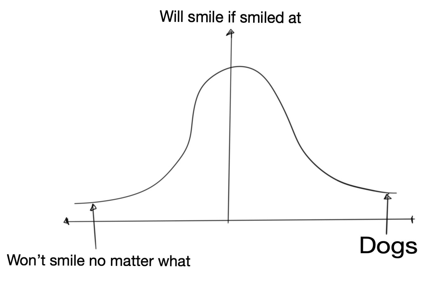
On an imaginary (and intuited) bell curve that covers all of humankind (and dogs), from the ones who wouldn’t smile no matter what you do, to the ones who’d smile without any reason, I find that most people fall around the region where they’ll smile if they get a smile, where smile is just a metaphor for acting kindly in some way. That is to say that most people are good at heart, just not very upfront about it. A small act of kindness from our end is enough to tap into that ocean of goodness that just lies below the hard top surface.
My point is, most people are super nice in some or the other form
The worst that happens here is that they don’t return the smile back, but giving away is usually in itself quite rewarding. Between a win and a jackpot, and I’m good with either.
Assume best of intentions; Try seeing things from a different perspective
Many things make sense only when we see them from another point of view. And thanks to the complexity of the world we live in, that’s not always possible. There are far too many factors that can influence the way a person thinks. Acknowledge that. Try to see if the case in question has a right/wrong solution or is it just a matter of difference in perspective. More often that not, latter is the case. For that reason, give the other person the benefit of doubt. Probably they had a good reason for acting in a certain way or saying what they said.
Don’t judge before understanding
One useful tool that I’ve developed over time is to resist the urge to judge someone or something before I have a complete understanding of the picture. Even if I somehow think I do, just knowing that a simple picture with zigzag lines is enough to confuse my mind, let alone complicated situations with hundreds and hundreds of variables, keeps me away from making very bold statements and trusting my thoughts too much.
In this case, being a software developer helps too. Anyone who has done any software engineering knows that no matter how good they get, they can never make statements like my code doesn’t have any bugs. In fact, the more software one writes, the less likely one is to make a statement like that. The same is true, I feel, for other walks of life.
Don’t be scared of looking stupid, making mistakes
Things will go south from time to time, not work out as per plan and even leave lasting bruises. Ideal outcome is just one of the many possible outcomes. I think these setbacks matter much less than our attitude in dealing with them. Sure, there’s the momentary joy in seeing things work out well, but there’s learning in seeing things not work out well. And learning goes much further than momentary joy (and of course, difficult times make for great stories).
Think of all the people in high school that you were once too scared to look stupid in front of. Think of the number of extracurriculars you didn’t participate in, skills that you didn’t learn, questions you didn’t raise your hand to answer to, just so that you could save yourself the momentary embarrassment in case you mess it up. Think of how many people are still in touch with you, or care about you, or even think about you once in a month. On this Earth-sized stage, the only definition of sanity is the one you set for yourself.
Laugh at yourself
Nothing is more powerful than the power to laugh at yourself. All of us have enough mistakes under our belt to write fat comic books out of it. From accidentally making inappropriate remarks that make me cringe whenever I remember them, to less intense fun mistakes that were quite painful at the time, I’ve done it all. And I’m not going to keep a straight face if you tell me you haven’t.
Don’t take it too seriously
I think we often overestimate how important we are. We’re granted a very limited time slot on this Earth stage, so why spend it under a false illusion of self importance and delusional (sometimes pretentious) seriousness. I think of myself as a macro-nihilist, meaning that while I understand the importance of my everyday, micro activities, I keep my emotional extremes in check by not forgetting that in the long run, none of my epic successes or catastrophic failures really matter much.
Being open to new cultures
You can’t shake hands with a closed fist. Similarly, if you’re too proud of the fact that you were randomly born into a specific geographic location or culture or religion or speak a particular language, you’ll find it very difficult to accept the majority of the human race that just as randomly happened to be born in another location or culture or religion or speak a different language. For me, it is a matter of celebration of similarities and differences, of simulating my life in a new culture and environment. That arouses a genuine interest in knowing things, and most people are willing to talk for hours if you show an interest.
On the other hand, being too proud of accidental things, while does feel good to practice thanks to our evolutionary history of tribalism, doesn’t help much when we meet people and experience cultures which are very different from our own.
Being predictable
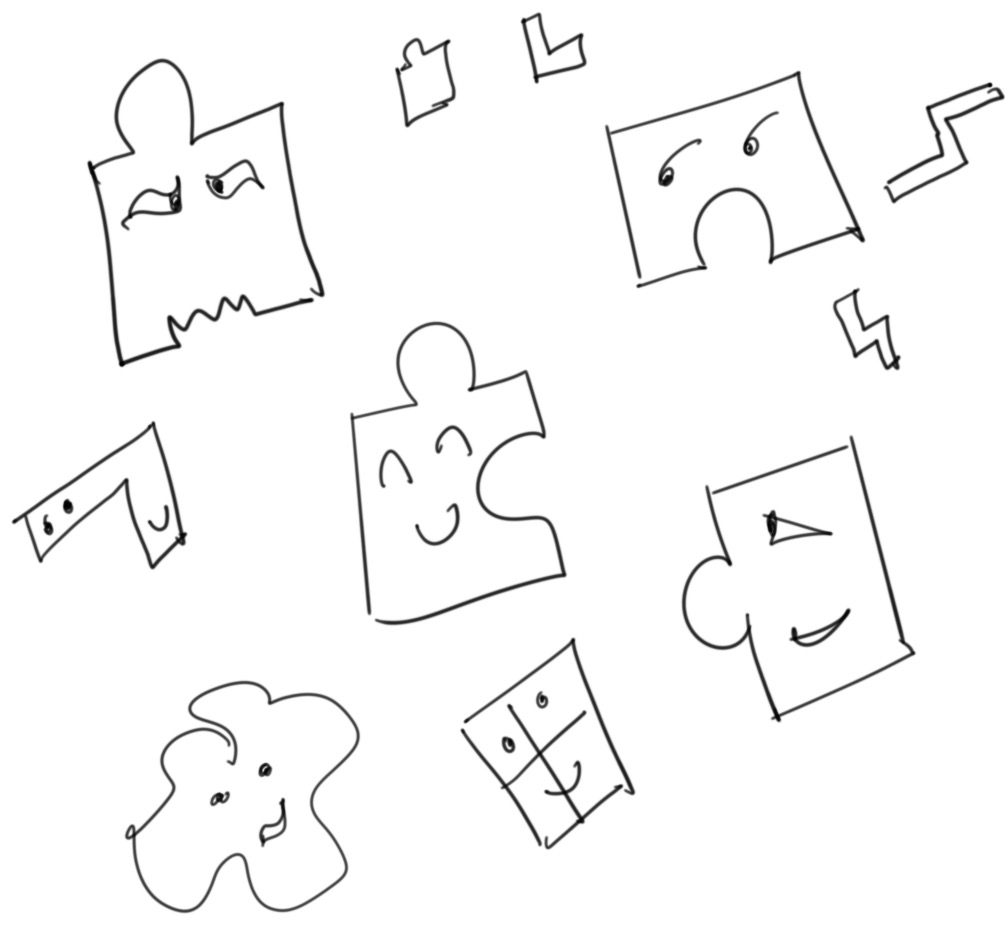
When I was little, there was this thing about being unpredictable that I thought made people cool and edgy. But as I grew up, I realized that I’m most comfortable around people who’re predictable. That doesn’t necessarily mean that I agree with them all the time, but just that they’re consistent in their behavior even with things, thoughts and ideas that I don’t agree with.
That’s what I try to adopt for myself. Just trying to be consistent with the way I am, having a more values driven approach towards decisions. It is like being a particularly shaped piece in a box full of puzzle pieces that’s constantly shaking. You can be weird, crazy, stupid, no problem. Eventually, you’ll end up with other pieces you are a perfect fit with.
In closing
I hope this article was interesting for you to read. I certainly did have fun writing it. I’m curious to read this piece again in about a year or so and see if there’s anything to add or remove. Thank you for reading. Ciao!
As web developers we’ve used countless UI libraries that give us an interface for creating grids. Now things have become much easier thanks to Grid and Flexbox in CSS, but it is still nice to have everything arranged in nice consistent classes for production use. Recently, I set out on a mini-mission to find a grid library for our new design system. In my search, I had to go through many libraries, their features and their source code. Most of them were 90% fit for my use case, but then I’d find some flaw that’d put me off. This continued for a couple of hours, at the end of which I uttered the golden developer words “I know, I’ll just implement my own grid library”. The old folks here know what follows. They also know, irrespective of whether you know if this is a bad idea, the temptation to start working in an empty file without any dependencies is too real to just ignore.
Anyway, after spending some time baking my own grid library, and slowly realizing that in probably a week or so, I’ll end up with exactly the kind of code that I’d rejected earlier, given how similar everything was looking, I decided to go with something readybaked. But this little exercise of trying to make a grid library taught me a lot about how these libraries are implemented. I wish to share some of that excitement, the learnings with you in this article.
By the end of this article, I want you to have at least a basic understanding of how a grid library is written and be confident to dig into the source code in case you need to customize a library to fit your needs. Note that I’m using Flexbox. Bootstrap 3 used widths and floats, and Bootstrap 4 uses Flexbox. I believe you can also use CSS3 Grids. Use what feels natural to you.
What’s a grid system?
A grid means what you’d expect it to mean. It is a two dimensional cellular structure, like a cupboard or a chess board, and you can put/place stuff on/in it. In the context of web development and design, grids usually just define the vertical or columnar properties. The reason is that we do not want to design for horizontal scrolling, and assume that all navigation on a page will be based on vertical scrolling. As a result, whatever the screen width is, we take that as 100% and divide it into the number of columns that we prefer.
First step is to set the number of columns that we’d like the designs to use. 12 is commonly used because with 12, we can divide the page into 1, 2, 3, 4, 6 and 12 parts (notice that those are just divisors of 12). Then we set the gutter size. Gutter is the gap between two columns. Usually we set it to 1rem which, if we haven’t modified, should be 16px.
After that, we set breakpoints. Breakpoints are points where our UI changes in response to a change in the screen size. For modern websites, we have to cater to a wide variety of browsers and screen sizes, and defining a set of screen sizes is our first step towards it. For example
0-450px can be considered to be small mobiles
450px-750px can be large mobiles
750px-1000px can be tables
1000px+ can be desktops
This is all very arbitrary, of course. we can set whatever sizes fit most of our users’ device types or just copy what Bootstrap or other popular libraries do (in general, when in doubt follow the standards).
Next is to actually implement designs that adhere to this grid system. Here we make an assumption that we have a UI hi-fi design mockup that was built using the same 12 column grid as base. For ease of implementation, we can define the CSS classes that we frequently use, which while not absolutely necessary, is helpful.
Basic CSS
While I mentioned that it isn’t absolutely necessary to have CSS classes that help us with grids, more often than not we’ll want to have some of them. The way we do it is we write classes for all the possible widths that a div might take on the screen, right from 1/12 to 12/12 (which is essentially 100% width).
.row{display:flex}.col-1{flex-basis:8.3333333%// (1/12)*100 }.col-2{flex-basis:16.666666%// (2/12)*100}// and so on
In this short snippet, a .row would be the wrapper class for one or more .col-X classes.
Styling our HTML
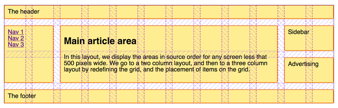
Consider the simple markup. This is a typical layout for a blog with a navigation section on the left, blog content in the center and a sidebar on the right with some widget.
Now, if we want to split the page into three columns; left sidebar (25% or col-3 containing the “.navigation”), main content (50% or col-6 containing “.content”) and right sidebar (25% or col-3 containing “.blog-roll”), we just have need to add the relevant classes to our markup
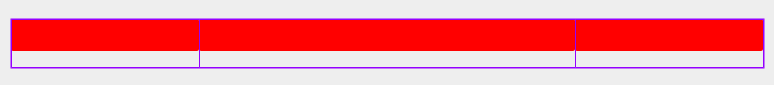
Notice how they just stick with each other without any padding. The purple border is Firefox developer tools showing us the layout.
Gutters
If you ignore the basic styling and borders, you’ll notice that there’s still no spacing between the columns (or gutters) here. We need spacing because otherwise we’ll have to add internal padding to all the columns and we do not want content from one column sticking to the content from another. To have some of that, we define a gutter variable and add half gutter width padding on right and left side of our columns.
Note that --gutter-half-width is just a variable in CSS that we access with the var() function. & > *[class^="col-"] selects all direct descendants of row class which have the col-* class set. :root selects the document root.
We don’t want gutters on the extreme left and extreme right of our grid. We compensate for that with negative margins on the .row class.
If you were to re-run the CSS again, we’d have something like the following.
Nice and tidy
Mobile responsiveness
At this point, our grid system is ready. Ready for one screen size, that is. Let’s see what happens if we switch to mobile view?
Eww!
I mean, it kind of does what we asked it to do, but if those columns were in fact two sidebars and one main content section, and this being displayed on a 320px screen, your users would be pretty irate (or worse, your website becomes popular on r/CrappyDesign). You don’t want that, don’t you?
To fix that, we’ll use the breakpoints that we had discussed about earlier. Essentially, we want to have three columns on desktops (which we’ve already made), one on tablet and one on mobile phones in a row. We start off with writing the media queries for each of our breakpoint.
@mediaonlyscreenand(max-width:449px){// classes for mobile view}@mediaonlyscreenand(min-width:450px){// classes for tablet view}@mediaonlyscreenand(min-width:768px){// classes for desktop view}
Next, we write the column CSS classes for each media query (same code, but we’ll rename them a bit so that we can tell which class is for which viewport). Notice the col-[viewport-name]-[column-width] format. You’ll might recognize this from libraries like Bootstrap (for example, col-md-3 or col-xs-6).
@mediaonlyscreenand(max-width:449px){.col-mobile-1{flex-basis:8.3333333%}.col-mobile-2{flex-basis:16.666666%}// col-mobile-3 to col-mobile-10.col-mobile-11{flex-basis:91.666666%}.col-mobile-12{flex-basis:100%}}@mediaonlyscreenand(min-width:450px){.col-tablet-1{flex-basis:8.3333333%}.col-tablet-2{flex-basis:16.666666%}// col-tablet-3 to col-tablet-12}@mediaonlyscreenand(min-width:768px){.col-desktop-1{flex-basis:8.3333333%}.col-desktop-2{flex-basis:16.666666%}// col-desktop-3 to col-desktop-12}
Now, we can edit our HTML to use these new classes. For each viewport, we add a class which tells the browser how wide it needs to be on that viewport. For example, our article section is 50% in width (or 6 out of 12 columns) on desktop, while 100% on tablet and mobile (or 12 out of 12 columns).
This will ensure our columns are 100% width on tablet and mobile screens. And because our classes are inside of media queries that only fire at the viewport width breakpoints, only the relevant class gets applied. As you can imagine, one can really fine tune how things look by selecting a higher number of breakpoints and designing for a more consistent UI across the spectrum of screen sizes.
Bonus – Hiding sections
Let’s say we decide that the blog-roll section isn’t super important on mobile screens, and should be removed. This is a common usecase; hiding specific blocks on specific viewports. And there’s a very easy way of doing this right in the grid system.
The little trick is to add hidden classes, just like our column classes, to our viewport media queries.
The flexbox standard defines various ways of arranging things inside the container both along the flex-direction axis (called the main axis) and the cross axis (the axis perpendicular to the main axis). If we were to extend this, we could define helper classes like .col-reverse (flex-direction: reverse) or .col-spread-out (justify-content: space-between) using these properties depending on our use cases.
In closing
The flexbox standard is pretty elaborate, and extremely well documented. There are also good libraries build around Flexbox that provide what we just build, and much more than that, out of the box. In production, one should try to stick to libraries and not reinvent the wheel.
Having said that, it is also important to understand the libraries that we use. Now we know what actually happens when we use that familiar col-md-6 class from Bootstrap, and if need be, we won’t shy away from editing the source code to make the library fit our needs!
One of the traits of Indians who speak the English language is using ‘no’ at the end of sentences which are questions. I do it from time to time. It is frequent for Yes/No questions where you say the entire sentence first as an assertion and at the end you put a ‘no?’ to tell the listener you’re actually asking if the statement you just made was true. For example, if you’d like to ask your friend Bob if he likes Green color, you’d say Do you like green color? I, on the other hand, would have to fight an (tiny) instinct and not say You like green color, no?
Not trying to imply we’re the only ones who do it, or that it is a super bad thing. And since it comes naturally to both the speaker and the listener, we understand each other just as well, and that is what matters in the end. But I was just wondering how do so many people make the same basic mistake.
While learning German, I notice that sometimes I try to literally translate sentences, words for words, when I’m not able to think fast enough. For example, Can you please help me? becomes Kannst du bitte helfen mir?, which is incorrect. Rule is, if there are two verbs in a sentence, the second verb is thrown at the very end. So the right way to say that is Kannst du mir bitte helfen?. But if you don’t practice, literal translation (from your native language) is what comes naturally.
I think this is what happens when we try to ask a Yes/No question as Indians. At least for me, my native languages are Hindi and Marathi. In both, an assertion for You like Mangoes would translate* to Tumhe aam pasand hai or Tula ambe avadtat. Now, Do you like Mangoes? just adds a ‘Na’ sound to the Hindi and Marathi version; Tumhe aam pasand hai na? and Tula ambe avadtat na? which, if you then reverse literal translate back to English, becomes You like Mangoes, no? (*using Hinglish and Marathlish here so that everyone can try pronouncing it).
Of course, you can say it differently in Hindi which would be similar to literal English translation, Kya tumhe aam pasand hai?, but it depends on how good your Hindi is, and the exact sentence. I honestly have no idea which one’s more correct.
So, to be honest, I’m waiting for a friend who got a little late, and decided to write this piece sitting in a park under a tree. It is kind of random, and I think I’ll find counter examples to this if I think a bit more on it. But yes, that’s it for this spontaneous article. Thank you for reading.