Listing down some interesting quotes from the book ‘A brief history of nearly everything’ by Bill Bryson.
Although the creation of a universe might be very unlikely, Tryon emphasized that no one has counted the failed attempts.
He makes an analogy with a very large clothing store: “If there is a large stock of clothing, you’re not surprised to find a suit that fits.”
“Huge parts of the world are still unexplored” “In terms of trilobites?” “No, in terms of everything”
Oh fuck, not another phylum
It is very easy to overlook this thought that life just is. As humans we are inclined to feel that life must have a point. We have plans and aspirations and desires. We want to take constant advantage of all the intoxicating existence we’ve been endowed with. But what’s life to a lichen? Yet its impulse to exist, to be, is every bit as strong as ours — arguably stronger. If I were told that I had to spend decades being a furry growth on a rock in the woods, I believe I would lose the will to go on. Lichens don’t. Like virtually all living things, they will suffer any hardship, endure any insult, for a moment’s additional existence. Life, in short, just wants to be. But — and here’s an interesting point — for the most part it doesn’t want to be much.
To a first approximation, as David Raup likes to say, all species are extinct.
…but you could have all Bdelloid Rotifer experts in the world to dinner and not have to borrow plates from the neighbors.
“And I suppose that’s why you value someone who spends forty-two years studying a single species of plants, even if it doesn’t produce anything terribly new?” “Precisely”
From an evolutionary point of view, sex is really just a reward mechanism to encourage us to pass on our genetic material.
It cannot be said too often: All life is one. That is, and I suspect will forever prove to be, the most profound true statement there is.
The 3rd of this month marked the completion my 24th year of existence, 24 revolutions around the sun, 24 years of the limited time that we are all handed when we board this earth train.
These were 24 years of great health, a relatively problem free life and great learnings. I’ve met and became friends with some amazing people who’ve made me question my priorities and values. Speaking of priorities, they’ve changed as well, although whether for the good or otherwise is something only time will tell. From someone who read and preached science (and be annoying sometimes), to becoming obsessed with my desktop PC and learning security (and be annoying most times), picking up social skills and learning how to talk to people (if you’re surprised this is something people need to learn separately, you’re probably not friends with many nerds), getting into web and open source, getting a full time job and so on. Life has had its share of twists and turns but it has been a joyride so far.
So how does it feel to be 24 years old? I think it is a superb feeling. Many things are changing, mostly for the good. People take you seriously, sort of. You feel the added responsibility when making decisions; decisions about your life and about those who surround you. People also seem to trust you with your decisions, which is nice. It feels like, finally, you’re in the driver’s seat. Eating what you like, taking care of your health and fitness and those kind of things have also picked up pace. On a health related note, I did a fair bit of outdoor sporting this year after around a decade long pause. With a sample size of one, I also think that the tendency to do things to please others, in general, goes on diminishing as we age.
At some point, I realized that some regrets are better than others. Regretting your decisions is better than other people’s. Similarly, regretting doing something is often better than the regret of not doing it. You also realize that many problems that you face are actually your choices. You can’t escape problems, but you can choose the ones you’d like to tackle by making conscious choices.
In the past couple of years, I’ve become a bit more independent; earn enough to support myself and my hobbies, and lived alone in my own flat. Moving to Berlin was by far the main highlight of this year. Like I keep mentioning, moving to a new city is like being handed a blank book. You can correct your past regrets, and try to be the person you always wanted to be, and not worry about your past self’s image in other people’s mind conflicting with the new one (for reasons which I’d not try to justify, I find it similar to starting a new code project versus fixing a legacy one).
And as always, with the added authority comes added responsibility. I noticed that I think longer before making decisions or even simply speaking, since those things now have consequences (and some people, my parents included, sometimes count on me to do the thinking). Overall, the theme of the last couple of paragraphs is that 24 is a good age to gain some autonomy, confidence in your self, control over your life and explore a bit. Not physically, necessarily, but philosophically, in the sense of what your values are, what do you expect from the people around you and what do you give them in return.
I wasn’t sure where an article like this belonged. Essentially, I wanted to document some of my philosophies (which is just a fancy way of saying that if I face a situation, these are the guiding principles that help me make decisions) that I think have helped me experience a lot more positivity within and from others wherever I’ve been (but mostly concerning places away from home). These are, of course, very personal and subjective. As with everything, I expect these to evolve over time and I myself might disagree with some of them at a later point in time. But then, reading my old thoughts and values, and documenting the new ones is exactly the point of this blog anyway.
Writing them down in no particular order.
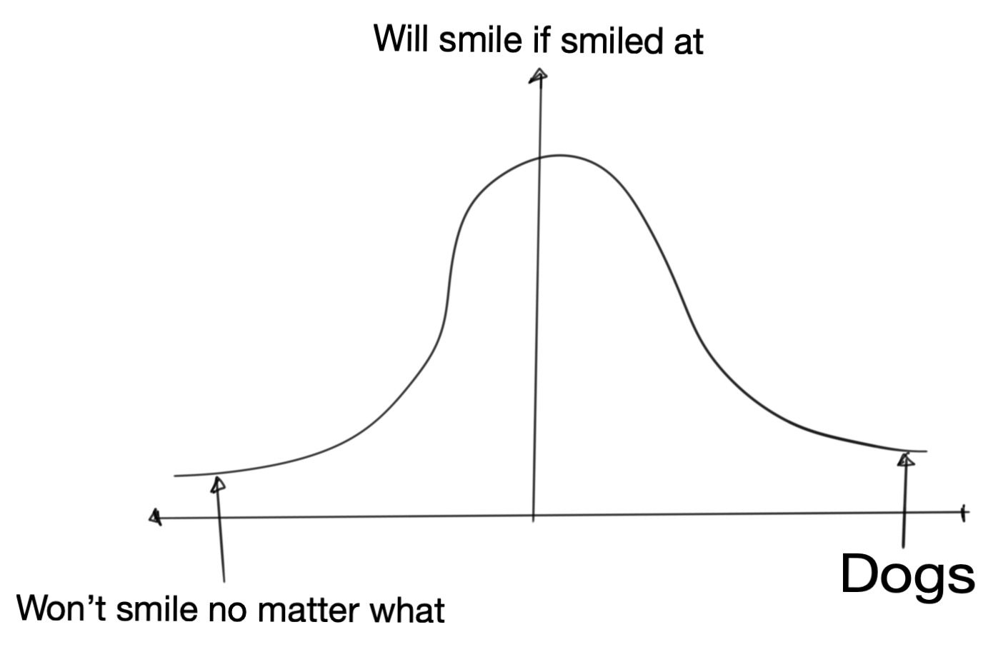
Smile first
On an imaginary (and intuited) bell curve that covers all of humankind (and dogs), from the ones who wouldn’t smile no matter what you do, to the ones who’d smile without any reason, I find that most people fall around the region where they’ll smile if they get a smile, where smile is just a metaphor for acting kindly in some way. That is to say that most people are good at heart, just not very upfront about it. A small act of kindness from our end is enough to tap into that ocean of goodness that just lies below the hard top surface.
My point is, most people are super nice in some or the other form
The worst that happens here is that they don’t return the smile back, but giving away is usually in itself quite rewarding. Between a win and a jackpot, and I’m good with either.
Assume best of intentions; Try seeing things from a different perspective
Many things make sense only when we see them from another point of view. And thanks to the complexity of the world we live in, that’s not always possible. There are far too many factors that can influence the way a person thinks. Acknowledge that. Try to see if the case in question has a right/wrong solution or is it just a matter of difference in perspective. More often that not, latter is the case. For that reason, give the other person the benefit of doubt. Probably they had a good reason for acting in a certain way or saying what they said.
Don’t judge before understanding
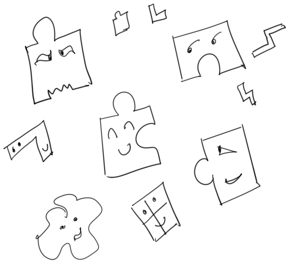
One useful tool that I’ve developed over time is to resist the urge to judge someone or something before I have a complete understanding of the picture. Even if I somehow think I do, just knowing that a simple picture with zigzag lines is enough to confuse my mind, let alone complicated situations with hundreds and hundreds of variables, keeps me away from making very bold statements and trusting my thoughts too much.
In this case, being a software developer helps too. Anyone who has done any software engineering knows that no matter how good they get, they can never make statements like my code doesn’t have any bugs. In fact, the more software one writes, the less likely one is to make a statement like that. The same is true, I feel, for other walks of life.
Don’t be scared of looking stupid, making mistakes
Things will go south from time to time, not work out as per plan and even leave lasting bruises. Ideal outcome is just one of the many possible outcomes. I think these setbacks matter much less than our attitude in dealing with them. Sure, there’s the momentary joy in seeing things work out well, but there’s learning in seeing things not work out well. And learning goes much further than momentary joy (and of course, difficult times make for great stories).
Think of all the people in high school that you were once too scared to look stupid in front of. Think of the number of extracurriculars you didn’t participate in, skills that you didn’t learn, questions you didn’t raise your hand to answer to, just so that you could save yourself the momentary embarrassment in case you mess it up. Think of how many people are still in touch with you, or care about you, or even think about you once in a month. On this Earth-sized stage, the only definition of sanity is the one you set for yourself.
Laugh at yourself
Nothing is more powerful than the power to laugh at yourself. All of us have enough mistakes under our belt to write fat comic books out of it. From accidentally making inappropriate remarks that make me cringe whenever I remember them, to less intense fun mistakes that were quite painful at the time, I’ve done it all. And I’m not going to keep a straight face if you tell me you haven’t.
Don’t take it too seriously
I think we often overestimate how important we are. We’re granted a very limited time slot on this Earth stage, so why spend it under a false illusion of self importance and delusional (sometimes pretentious) seriousness. I think of myself as a macro-nihilist, meaning that while I understand the importance of my everyday, micro activities, I keep my emotional extremes in check by not forgetting that in the long run, none of my epic successes or catastrophic failures really matter much.
Being open to new cultures
You can’t shake hands with a closed fist. Similarly, if you’re too proud of the fact that you were randomly born into a specific geographic location or culture or religion or speak a particular language, you’ll find it very difficult to accept the majority of the human race that just as randomly happened to be born in another location or culture or religion or speak a different language. For me, it is a matter of celebration of similarities and differences, of simulating my life in a new culture and environment. That arouses a genuine interest in knowing things, and most people are willing to talk for hours if you show an interest.
On the other hand, being too proud of accidental things, while does feel good to practice thanks to our evolutionary history of tribalism, doesn’t help much when we meet people and experience cultures which are very different from our own.
Being predictable
When I was little, there was this thing about being unpredictable that I thought made people cool and edgy. But as I grew up, I realized that I’m most comfortable around people who’re predictable. That doesn’t necessarily mean that I agree with them all the time, but just that they’re consistent in their behavior even with things, thoughts and ideas that I don’t agree with.
That’s what I try to adopt for myself. Just trying to be consistent with the way I am, having a more values driven approach towards decisions. It is like being a particularly shaped piece in a box full of puzzle pieces that’s constantly shaking. You can be weird, crazy, stupid, no problem. Eventually, you’ll end up with other pieces you are a perfect fit with.
In closing
I hope this article was interesting for you to read. I certainly did have fun writing it. I’m curious to read this piece again in about a year or so and see if there’s anything to add or remove. Thank you for reading. Ciao!
As web developers we’ve used countless UI libraries that give us an interface for creating grids. Now things have become much easier thanks to Grid and Flexbox in CSS, but it is still nice to have everything arranged in nice consistent classes for production use. Recently, I set out on a mini-mission to find a grid library for our new design system. In my search, I had to go through many libraries, their features and their source code. Most of them were 90% fit for my use case, but then I’d find some flaw that’d put me off. This continued for a couple of hours, at the end of which I uttered the golden developer words “I know, I’ll just implement my own grid library”. The old folks here know what follows. They also know, irrespective of whether you know if this is a bad idea, the temptation to start working in an empty file without any dependencies is too real to just ignore.
Anyway, after spending some time baking my own grid library, and slowly realizing that in probably a week or so, I’ll end up with exactly the kind of code that I’d rejected earlier, given how similar everything was looking, I decided to go with something readybaked. But this little exercise of trying to make a grid library taught me a lot about how these libraries are implemented. I wish to share some of that excitement, the learnings with you in this article.
By the end of this article, I want you to have at least a basic understanding of how a grid library is written and be confident to dig into the source code in case you need to customize a library to fit your needs. Note that I’m using Flexbox. Bootstrap 3 used widths and floats, and Bootstrap 4 uses Flexbox. I believe you can also use CSS3 Grids. Use what feels natural to you.
What’s a grid system?
A grid means what you’d expect it to mean. It is a two dimensional cellular structure, like a cupboard or a chess board, and you can put/place stuff on/in it. In the context of web development and design, grids usually just define the vertical or columnar properties. The reason is that we do not want to design for horizontal scrolling, and assume that all navigation on a page will be based on vertical scrolling. As a result, whatever the screen width is, we take that as 100% and divide it into the number of columns that we prefer.
First step is to set the number of columns that we’d like the designs to use. 12 is commonly used because with 12, we can divide the page into 1, 2, 3, 4, 6 and 12 parts (notice that those are just divisors of 12). Then we set the gutter size. Gutter is the gap between two columns. Usually we set it to 1rem which, if we haven’t modified, should be 16px.
After that, we set breakpoints. Breakpoints are points where our UI changes in response to a change in the screen size. For modern websites, we have to cater to a wide variety of browsers and screen sizes, and defining a set of screen sizes is our first step towards it. For example
0-450px can be considered to be small mobiles
450px-750px can be large mobiles
750px-1000px can be tables
1000px+ can be desktops
This is all very arbitrary, of course. we can set whatever sizes fit most of our users’ device types or just copy what Bootstrap or other popular libraries do (in general, when in doubt follow the standards).
Next is to actually implement designs that adhere to this grid system. Here we make an assumption that we have a UI hi-fi design mockup that was built using the same 12 column grid as base. For ease of implementation, we can define the CSS classes that we frequently use, which while not absolutely necessary, is helpful.
Basic CSS
While I mentioned that it isn’t absolutely necessary to have CSS classes that help us with grids, more often than not we’ll want to have some of them. The way we do it is we write classes for all the possible widths that a div might take on the screen, right from 1/12 to 12/12 (which is essentially 100% width).
.row{display:flex}.col-1{flex-basis:8.3333333%// (1/12)*100 }.col-2{flex-basis:16.666666%// (2/12)*100}// and so on
In this short snippet, a .row would be the wrapper class for one or more .col-X classes.
Styling our HTML
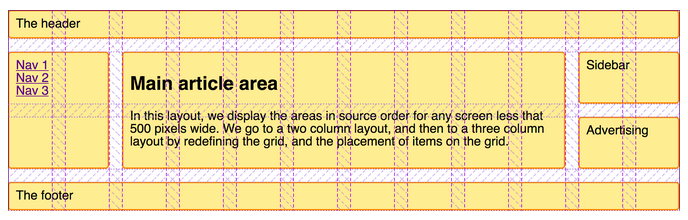
Consider the simple markup. This is a typical layout for a blog with a navigation section on the left, blog content in the center and a sidebar on the right with some widget.
Now, if we want to split the page into three columns; left sidebar (25% or col-3 containing the “.navigation”), main content (50% or col-6 containing “.content”) and right sidebar (25% or col-3 containing “.blog-roll”), we just have need to add the relevant classes to our markup
Notice how they just stick with each other without any padding. The purple border is Firefox developer tools showing us the layout.
Gutters
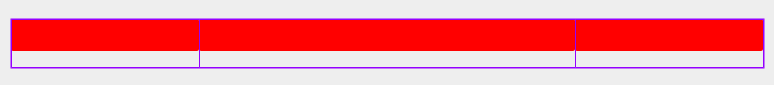
If you ignore the basic styling and borders, you’ll notice that there’s still no spacing between the columns (or gutters) here. We need spacing because otherwise we’ll have to add internal padding to all the columns and we do not want content from one column sticking to the content from another. To have some of that, we define a gutter variable and add half gutter width padding on right and left side of our columns.
Note that --gutter-half-width is just a variable in CSS that we access with the var() function. & > *[class^="col-"] selects all direct descendants of row class which have the col-* class set. :root selects the document root.
We don’t want gutters on the extreme left and extreme right of our grid. We compensate for that with negative margins on the .row class.
If you were to re-run the CSS again, we’d have something like the following.
Nice and tidy
Mobile responsiveness
At this point, our grid system is ready. Ready for one screen size, that is. Let’s see what happens if we switch to mobile view?
Eww!
I mean, it kind of does what we asked it to do, but if those columns were in fact two sidebars and one main content section, and this being displayed on a 320px screen, your users would be pretty irate (or worse, your website becomes popular on r/CrappyDesign). You don’t want that, don’t you?
To fix that, we’ll use the breakpoints that we had discussed about earlier. Essentially, we want to have three columns on desktops (which we’ve already made), one on tablet and one on mobile phones in a row. We start off with writing the media queries for each of our breakpoint.
@mediaonlyscreenand(max-width:449px){// classes for mobile view}@mediaonlyscreenand(min-width:450px){// classes for tablet view}@mediaonlyscreenand(min-width:768px){// classes for desktop view}
Next, we write the column CSS classes for each media query (same code, but we’ll rename them a bit so that we can tell which class is for which viewport). Notice the col-[viewport-name]-[column-width] format. You’ll might recognize this from libraries like Bootstrap (for example, col-md-3 or col-xs-6).
@mediaonlyscreenand(max-width:449px){.col-mobile-1{flex-basis:8.3333333%}.col-mobile-2{flex-basis:16.666666%}// col-mobile-3 to col-mobile-10.col-mobile-11{flex-basis:91.666666%}.col-mobile-12{flex-basis:100%}}@mediaonlyscreenand(min-width:450px){.col-tablet-1{flex-basis:8.3333333%}.col-tablet-2{flex-basis:16.666666%}// col-tablet-3 to col-tablet-12}@mediaonlyscreenand(min-width:768px){.col-desktop-1{flex-basis:8.3333333%}.col-desktop-2{flex-basis:16.666666%}// col-desktop-3 to col-desktop-12}
Now, we can edit our HTML to use these new classes. For each viewport, we add a class which tells the browser how wide it needs to be on that viewport. For example, our article section is 50% in width (or 6 out of 12 columns) on desktop, while 100% on tablet and mobile (or 12 out of 12 columns).
This will ensure our columns are 100% width on tablet and mobile screens. And because our classes are inside of media queries that only fire at the viewport width breakpoints, only the relevant class gets applied. As you can imagine, one can really fine tune how things look by selecting a higher number of breakpoints and designing for a more consistent UI across the spectrum of screen sizes.
Bonus – Hiding sections
Let’s say we decide that the blog-roll section isn’t super important on mobile screens, and should be removed. This is a common usecase; hiding specific blocks on specific viewports. And there’s a very easy way of doing this right in the grid system.
The little trick is to add hidden classes, just like our column classes, to our viewport media queries.
The flexbox standard defines various ways of arranging things inside the container both along the flex-direction axis (called the main axis) and the cross axis (the axis perpendicular to the main axis). If we were to extend this, we could define helper classes like .col-reverse (flex-direction: reverse) or .col-spread-out (justify-content: space-between) using these properties depending on our use cases.
In closing
The flexbox standard is pretty elaborate, and extremely well documented. There are also good libraries build around Flexbox that provide what we just build, and much more than that, out of the box. In production, one should try to stick to libraries and not reinvent the wheel.
Having said that, it is also important to understand the libraries that we use. Now we know what actually happens when we use that familiar col-md-6 class from Bootstrap, and if need be, we won’t shy away from editing the source code to make the library fit our needs!
One of the traits of Indians who speak the English language is using ‘no’ at the end of sentences which are questions. I do it from time to time. It is frequent for Yes/No questions where you say the entire sentence first as an assertion and at the end you put a ‘no?’ to tell the listener you’re actually asking if the statement you just made was true. For example, if you’d like to ask your friend Bob if he likes Green color, you’d say Do you like green color? I, on the other hand, would have to fight an (tiny) instinct and not say You like green color, no?
Not trying to imply we’re the only ones who do it, or that it is a super bad thing. And since it comes naturally to both the speaker and the listener, we understand each other just as well, and that is what matters in the end. But I was just wondering how do so many people make the same basic mistake.
While learning German, I notice that sometimes I try to literally translate sentences, words for words, when I’m not able to think fast enough. For example, Can you please help me? becomes Kannst du bitte helfen mir?, which is incorrect. Rule is, if there are two verbs in a sentence, the second verb is thrown at the very end. So the right way to say that is Kannst du mir bitte helfen?. But if you don’t practice, literal translation (from your native language) is what comes naturally.
I think this is what happens when we try to ask a Yes/No question as Indians. At least for me, my native languages are Hindi and Marathi. In both, an assertion for You like Mangoes would translate* to Tumhe aam pasand hai or Tula ambe avadtat. Now, Do you like Mangoes? just adds a ‘Na’ sound to the Hindi and Marathi version; Tumhe aam pasand hai na? and Tula ambe avadtat na? which, if you then reverse literal translate back to English, becomes You like Mangoes, no? (*using Hinglish and Marathlish here so that everyone can try pronouncing it).
Of course, you can say it differently in Hindi which would be similar to literal English translation, Kya tumhe aam pasand hai?, but it depends on how good your Hindi is, and the exact sentence. I honestly have no idea which one’s more correct.
So, to be honest, I’m waiting for a friend who got a little late, and decided to write this piece sitting in a park under a tree. It is kind of random, and I think I’ll find counter examples to this if I think a bit more on it. But yes, that’s it for this spontaneous article. Thank you for reading.
I held the elevator open for an elderly lady entering the building. She thanked me, and saw the floor that was already active. Her apartment was on the same floor, she said. I exclaimed “Neighbors!”, to which she smiled and said, yes. On reaching the floor, we discovered that we live in flats directly opposite to each other. We got talking; what I did and where I was from. Turned out, she lived in New Delhi with her husband for 5 years! I told her about my internship there for a couple of months. She could even tell the neighborhood she was in, which was pretty close to where I lived.
Incidents like these make you realized that the world’s not that big of a place. This entire conversation took place in German (at least I tried to) which was kind of a big deal for me. New language skill put to good use!
In the part 1 of this post, I wrote about getting a new laptop from/for work. I also dug into the similarities and differences between my old Thinkpad T440 and my work computer, a Macbook Pro.
Now, after more than 6 months of using the Macbook as my primary computer, I switched back to my Thinkpad. In this article, I’ll get into what I missed from the Thinkpad (which was slightly different from what I thought I’d miss) and what the tipping point for the switch was. This is a personal account, and as such, is shaped by the way I perceive things. Probably it would have been very different if I’d used a Macbook from an early age and made my first shift to a GNU/Linux distro 6 months ago.
Control
You lose a lot of control from over your system when you run a proprietary operating system (and most software on it). That feels obvious when I write it that way, but we often forget or take things for granted when using a GNU based operating system that we realize only when we switch to something like MacOS. There are ways of customing MacOS, no doubt, but they aren’t nearly as powerful (or simple) as the ones available on most distros on Linux.
It is worth noting that control isn’t strictly needed, and is a preference. But if you do prefer to be able to tinker with the way your system looks, feels and works, then you’ll find that preference better respected on this side of the fence.
UI
No matter how hard I try, I just couldn’t get myself to like the gestures and animations in MacOS. My brain is kind of stuck in the old school menus of Windows XP/7 (and hence, xfce). Also, having spent a lot of time customizing my status bar in xfce, I couldn’t help but feel under-equipped trying to do the same on MacOS. Not a huge fan of the bubbly semi-transparent UI scheme either.
New learnings
Depending on how you see it, it can be regarded as both good and bad. Most things just work out of the box in MacOS. It is like buying a fully furnished house. That frees you from having to think about things like setting up Wifi, Bluetooth, screen brightness and so on. All keys on the keyboard do what they say they do, sound works out of the box, and even if you break something, you can always take it to someone to get it fixed (Not very sure if/how the last one works, but guessing there’s some kind of support available to Macbook customers).
While all this sounds perfect (and it is, if that’s what you need), most of what I have learnt about computers is through fixing stuff that I broke while tinkering with it. A couple of months of MacOS usage made me realize that I’m not learning even a fraction of what I’d have otherwise did if I was using a broken system, full of shortcomings. I’ll let a quote from Moxie Marlinspike’s The Worst to summarize my thoughts.
…no matter how much research they do, a partisan of the best might not ever know as much about motorcycles as the partisan of the worst who takes a series of hare-brained cross-country motorcycle trips on a bike that barely runs, and ends up learning a ton about how to fix their constantly breaking bike along the way. The partisan of the best will likely never know as much about sailing as the partisan of the worst who gets the shitty boat without a working engine that they can immediately afford, and has no choice but to learn how to enter tight spaces and maneuver under sail.
Speed disappointments
So, in exchange of all of that, I assumed, I’ll be using a system that’s super smooth and faster than anything I’d ever used. Nop. Not even that. It was just as fast as my old computer. I think newer CPUs and hardware in general are quite overrated for most people’s use cases. If you know even a tiny bit of what you’re doing (and aren’t part of that minority of computer users that actually needs powerful hardware), you can make a 5-10 year old computer work more or less the same way as any modern computer.
Community
While I moved away from my Thinkpad, and by extension, the *nix community, it didn’t move away from me. I was constantly reminded of how customizable my desktop could’ve been at r/unixporn, how over 10 year old laptops are still daily drivers of many at r/thinkpad, how easy getting your operating to do something for you used to be at StackOverflow and what good documentation should look like at ArchWiki. All in all, I missed the community.
Tipping point
While all of this was coming to my notice slowly, a major turning point was hearing Hakun Lie and Bruce Lawson at DevBreak two months ago. There, I got to know about web standards and where things are heading. It was fun to get reminded of the things that excited me about web in the first place. Then, Bruno walked me through a project of his that used some of the newer web apis. I was blown away, and honestly a little embarrassed to have forgotten the passion with with people talk about the web and engineering things on it. I just wanted to get back to my old world.
Final thoughts
So I got back on my Thinkpad running a fresh installation of Arch and i3, and writing this on the same. Trying to get the function keys working never gets old for me, and the joy of having found the solution on the internet, implementing it and getting it to work and in the process actually understanding what happens when you press a function key is something you learn by actually doing it. This, and countless such experiences are what make it so much fun to be in the GNU/Linux ecosystem.
My recent post was about finally getting a permanent flat in Berlin, especially one within walking distance of my workplace, which must’ve been a dream of many. It certainly was one of mine. Coming from Mumbai, where a commute of an hour or two is no biggie, Berlin has been a pleasant surprise.
None of my commute here has been more than 30 minutes one side, and the current one is 12 minutes walk, 7 on bike. My one day’s commute distance in Mumbai would now be equal to 3.75 working months, or roughly 75 days of commute here in Berlin (of course, I took a train, but you get the idea). But that’s also partly because I travelled an insane distance from home to work back in Mumbai.
So while everything sounds all sunshine, I could see some disadvantages of this setting after living here for three weeks. A thing to note here, before we get into the fun stuff, is that when I say disadvantages and problems, I say that in a purely first world problems sense. It really is a privilege to even have such problems, and no, this is in no way comparable to the struggle of trying to push your body inside an overcrowded Mumbai local train on Ghatkoper station at 8 in the evening after a tiring workday.
So, having taken care of the internal guilt, let’s get started.
No time to read
My college commute was a good 90 minutes in a single direction. And I was lucky because I’d just get in the train, grab a good seat and start reading. It would either be a physical book or a PDF in my phone. That’s the best part of having long commutes. It is so boring that you don’t need to tell yourself to read, it just happens.
Now, my days are exactly of the same length and I am working for roughly the same number of hours. But I have no idea where those extra hours that I’d spend in trains went. They say gas molecules take up all the space available to them. Guess that’s true of work and time as well. I’m barely left with time to read, and when I do, I don’t (unless I force myself, which isn’t the best long term strategy).
Fewer food options
When you live at one place, and work at the other, you essentially have two different worlds. So during the week, you go to one set of restaurants, and over the weekend, you’re free to try the other set. But when you live so close, you end up going to the same places even during the weekends. It is just a weird feeling to be walking the same paths and going to the same places to eat that you would during the weekdays with your colleagues.
No alternate mode of transport
Living at all the other places, I would have the default option of taking the subway. Sometimes, I’d take one of those rented bikes. Occasionally, when the day is good, I’d just walk. Now, it is just walk or bike, which, while not a terrible thing, doesn’t leave much room for variation. There’s no place in between work and home where you’d just stop by to grab a bite, or a river where you’d spend ten minutes just looking at the boats passing. It’s just Home > Work > Home.
Less motivation to WFH
There used to be good reasons to work from home. I could save commute time, have different food options and probably go to a park in the evening. Now, not much time saved and I end up eating at the same place.
More frequently late to work
I always knew this would be the case, even back in college. The people who were super late to classes were the ones who lived the closest. I can feel the same happening to me now. I find it more difficult to reach the office at a particular time than when I used to commute by subway. During college, since I took the same train everyday, I’d reach perfectly at the time I had planned (unless the trains messed it up, which wasn’t unusual). I guess even this is more of a discipline issue which I need to fix.
In closing
If I sounded like a spoilt teenager in this post, that’s probably fair. If you find a place to live close to your workplace, take it by all means. It is worth it, and will be a good test of discipline and time management for you. Plus, not having to take public transport or having a place to grab a bite on my way from work, I manage to save good money.
Finally, working full time and reaching home at 5 in the evening is a dream for a tech worker. It is like you have another day after you get back. I use mine to learn a new language, which is only feasible in a setting like mine. I hope you found this article fun to read, that’s what I meant it to be.
The best way to learn is to teach, they say. I totally agree, and that’s one reason I have so many articles on my blog explaining random topics. Part of the goal was always to understand the topic better myself.
I got reminded of it while I was preparing for a workshop on introduction to web technologies for my fellow Berliners who wish to get into tech. Then something interesting happened. I found the root of a problem that I was struggling with for some time at work. I will jot down some notes of this entire experience, and try to tell you about the lessons learned.
Our Styleguide
We maintain a frontend styleguide (think: company-specific UI library). We have many HTML elements and CSS classes that make our text, buttons and cards look the way we want them to look across the webapps. There’s a little issue. Most textual styles are defined on HTML elements. So to get a large heading styled with our predefined font-size, font-family, color and a bunch of other styles, one would just use h1 (notice: no class needed).
This worked for us until now, and wherever a big heading was required, we would just throw in an h1. Similarly for paragraphs, lists and other textual elements. This made a lot of sense in the past as accessibility or SEO weren’t a concern. But things changed.
Multiple h1s
It all started when our contracted SEO agency told us that we had two h1s on a page. We looked at the page, and it made total sense. There were two ‘headings’ of super large size, and our styleguide’s h1 made total sense from a purely visual perspective. But the second heading was just a title in large font. It had no semantic significance. Now, our product’s main title and some random text have the same precedence on the page.
This is bad for SEO, no doubt, but this is also bad for screen readers and all mini browsers (like Apple Watch and the like) which rely on the HTML to convey semantic information, and not visual.
Thinking and problem solving
I went to our designers and had a discussion. I could just hack and overwrite the styles, but that wasn’t the point. I asked what could be done. We could change the design, create a new class the resembles heading-1s and then use that on a span and so on. But we couldn’t think of why we’ve met with this problem. Maybe we’re missing something, something obvious, we thought.
Conference on web basics
I attended a developer conference a couple of weeks ago. There we had the good fortune of listening to Hakun Lie and Bruce Lawson. What struck me, apart from how much they cared about web standards and saving the web from the bloat hell that we’re hurtling towards, is how much one can accomplish just by sticking to web standards. One of the examples used was of the Apple Watch, and the website in question was developed much before anyone imagined a browser on your wrist. If one just uses semantic HTML, one can be sure that their website would work on any device, whether in existence or yet to arrive. And just like that, millions of well-designed websites started to work on the special Apple Watch browser.
This is important to note because there are usually multiple ways of doing something on the web. More often than not, there are a couple of right and many wrong ways. Part of our job as web developers is to ensure that our website isn’t just pretty visually but also correct semantically and structurally. This is to futureproof our creation.
The workshop
I was preparing for this workshop and thinking of various ways I could introduce web development to complete beginners. I referred to some nice articles and tried to understand the meaning of HTML and CSS myself. I tried to understand why reset.css and normalize.css are used, even though I’ve been using them for years. I came up with interesting analogies to explain the basic pillars of the web and as a result, improved my understanding of these constructs.
Lightbulb moment
After the workshop, when I went back to my codebase, I could see the problem staring right back at me. We had styled the HTML elements, and not created separate classes that we could then attach to our elements. This is the result of forgetting the basics and doing something the wrong way because it saves you from writing class="" for every HTML element, which to be fair, doesn’t seem that bad when you don’t differentiate between HTML and CSS and use a combination of the two to get the design right.
Conclusion
There are a couple of conclusions for me from this article. One is to learn and follow web standards. Semantic HTML is not at all hard, just some 120 tags in total. Then, understand what a markup language means, and how the semantics of a document is different from how it looks or works. Learn the rules of CSS selectors and how cascading works. Learn that HTML and CSS are declarative, and use them as much as possible. Only where it makes sense, introduce Javascript. In general, keep abstractions to a minimum.
I arrived in Berlin some six months ago. From that point until now, I have lived in three different parts of the city and I’ve finally found my permanent nest in the fourth one. I want to share some things about this entire journey, from my Airbnb to this flat, and retrospect some interesting experiences and observations I had along the way.
So yes, that’s four moving-ins that we’re talking about in the span of 6 months. Four times I had to pack, carry, unpack, repack my 40-ish kg mini-world. To be honest, I didn’t quite enjoy any of the shifting experience at all, possibly because I was doing it using public transport and possibly because those aren’t enjoyable experiences in general.
That said, I really loved all of those flats and their respective neighborhoods. Berlin has many colors, and you only see them when you live in its different districts. We’ll get into some of those later on in this post, but first let’s start with the search process itself.
In Berlin, there’s a shortage of apartments to live in, and an abundance of people on the hunt for one. It is almost like searching for a job. You show up for viewings at the time decided by the owner of the flat. First thing you notice is, especially if it is a half decent flat, there are a dozen more people wishing to get the same flat. The owners (or people appointed by them) judge if you can be the ideal tenant (based on many things, not the least of which are your payslips and SCHUFA scores). After the viewing, you go home and wish you get accepted by the almig…umm the landlord. Repeat this several times a day for a couple of months.
I just couldn’t stand this entire process. I went for a couple of listings, but gave up. Too much work. For that reason, all of the previous apartments I’ve lived in were some sort of referral homes. And that’s one big reason it took me so long.
Getting over previous flats
What I found surprising was how quickly I got over the previous flats, even though while living there I really wanted to make them my own. Every apartment, except for the first one, was handed over to me with some dangling hope that it would be signed over to me. And I would really get attached to the apartment, only to later find out that due to so and so reason, I won’t be getting it. While that’s heartbreaking in the moment, it was interesting to retrospect on how adaptive our brains are. Couple of days after moving in, I would just forget about the previous place and start over again.
Starting over again was a very typical process; finding a nearby supermarket, finding restaurants, exploring the area for parks and places of interest during the weekends. A week later, everything is in autopilot; from commuting to work to refilling groceries. Also interesting is how cryptic a new place seems in terms of streets and direction, but a month later I could really get around the neighborhood without even thinking. Yet another proof of the power of repetition.
Amenities and flat size
I was searching for a flat for myself. I preferred to not live in a shared flat (or a WG – Wohngemeinschaft as it is called in German). An important thing to note is that many flats come empty, that is, without any fittings. Not even a kitchen is fitted. I wanted a somewhat furnished flat as that made more sense economically. Furnishing usually involves a bed, cabinet, fitted kitchen with fridge and other kitchen stuff, washer. Dishwasher in rare cases. That’s more than sufficient to get started.
Flat sizes are measured in square meters (1 sqm is 10.something sq feet). They usually have one or two rooms (zimmers in German, excluding kitchen and bathroom). The flats in my budget were quite diverse, from 25 sqm one room to 65 sqm 2.5 room ones depending on the neighborhood and public transportation options. I decided to deprioritize size and focus on furnishing in the flat and being close to work and city center.
Neighborhoods
This is my favorite part of the search: Being able to experience different neighborhoods. As I mentioned, Berlin offers many shades of itself if you move to different districts in the city. The people change, and so does the food and the way the buildings look. I was fortunate enough to live in both east and west Berlin. Over the past six months, I lived in Friedrichshain, Kreuzberg, Mitte-Prenzlauerberg and now Mitte.
Friedrichshain was the first. Where I lived, it was very silent. Not many stores or restaurants. It was an ideal place to live once you’ve been in the hustle and bustle of the city for years. For me, it was a bit depressing, especially after coming from India. I didn’t explore much of it, but now that I’ve spent sometime here, I can see it had a lot of options for food and other stuff.
Bergmannkiez – Kreuzberg was next. This is a fancy area, very touristy but still good to live in. Very diverse crowd with many cultures living together. There is this street called Bergmannstrasse that had great food options. Tempelhof airfield was nearby and this was the time I got into outdoor activities and hanging out with my colleagues and their friends. There are nice Biergartens (Beer gardens) that people go to to meet friends and play indoor games. Tempelhofer Feld is still my favourite place in Berlin.
Just go there on a weekend, lay in the grass and read a book or something
Third was Mitte-Prenzlauerberg area. This is a upmarket locality with nice cafes and cake places. I didn’t quite like the food there (think bland food, loads of salad and sprouts. In short, way too healthy) but I liked the neighborhood and people in general. This was also on the same street as Mauer Park where I’d spend a lot of time over the weekends.
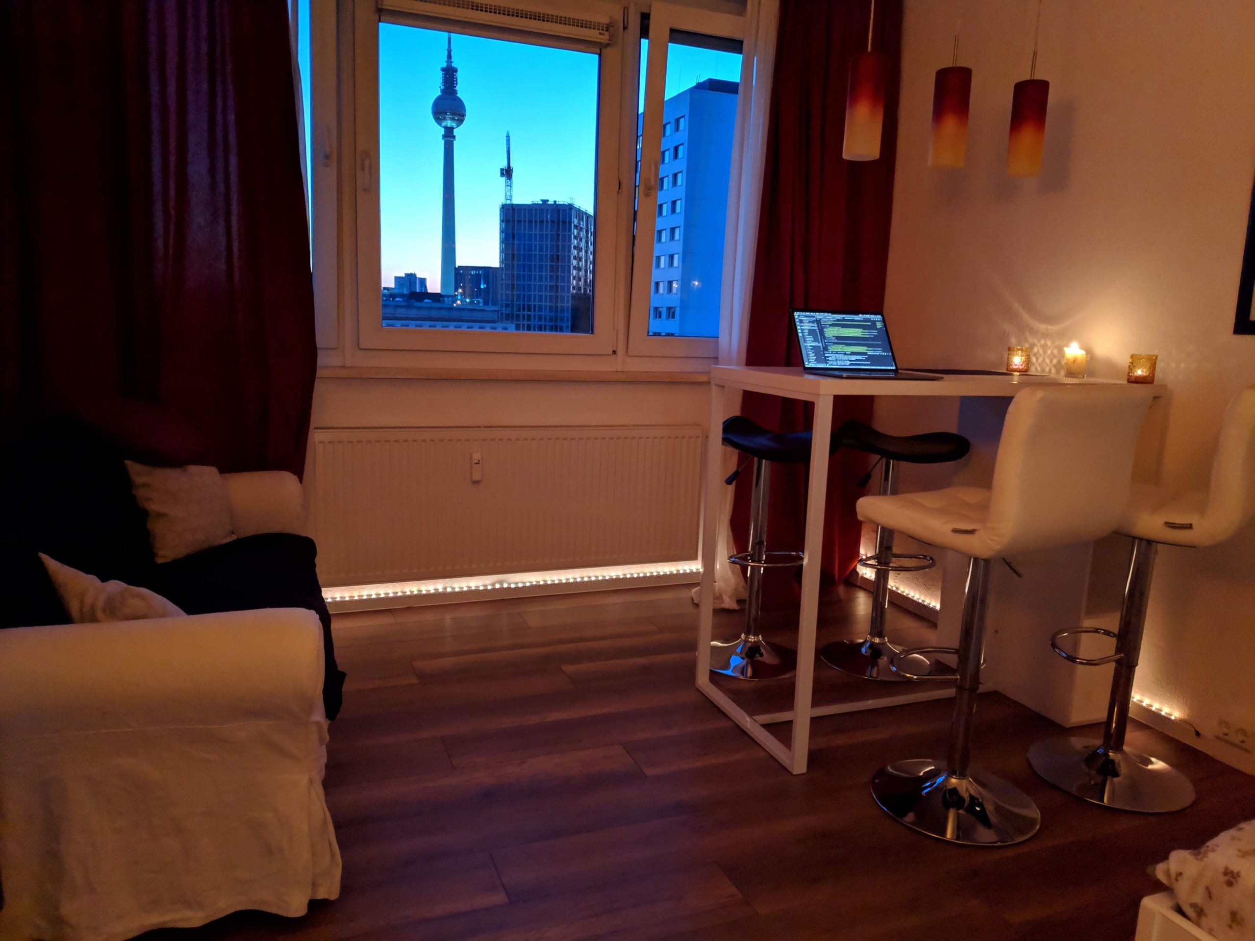
Fourth and current place is in the heart of Mitte, literally meaning center in German. Nothing special, but very center. Around a kilometer from Alexanderplatz and my office. Now I can reach work in less than 10 minutes, which is nice. Coincidentally, this is almost exactly in the middle of all the previous places and I can go to all of my favorite parks and snack bars from the previous places easily. As a bonus, I can see the Fernsehturm right from my living room!
The window is my gateway to daydreaming, especially when it turns dark. Reminds me of my desk at LaughGuru in Mumbai. As you can tell from the LEDs and candles, I try hard to make my house look pretty.
Learnings
If I had to start over again, I’d do a couple of things differently. I’d probably put in a bit more effort into the hunt as opposed to completely relying on connections all the time (which is fine, but seriously limits the scope of your search). Facebook groups and sites like ebay-kleinanzeigen.de are good places to search, and much less commercialized compared to immobilienscout24 where each listing has dozens of takers.
But when you think about it, how else would I have gotten the experience of living in those many different areas right after coming here, within six months. Back when I used to look at Berlin’s map, I would wonder how long it would take to have a general intuition of where everything was, the way I had for Mumbai. This entire apartment search debacle fast forwarded this process and I know parts of the city that I’d have otherwise not known.
In closing
While writing this post, I realized that by wishing for things to work out well right away, we actually miss out on a lot of interesting experiences. Was it inconvenient to miss the connecting flight and luggage on my way to Berlin or not finding an apartment for six months straight? No doubt it was. But looking back at those experiences, would I trade them for a smoother ride? definitely not.