Although when I started with it, I hardly knew anything about a blogger template, but it turned out, designing a blogger template is easier than designing a HTML template. Just a few basic concepts and you are good to go.
Firstly, before digging into the template code, we will look at the grammar needed to code our thing. This simple article assumes you can read basic HTML, CSS and XML. Nothing above the basic level, plain simple stuff. If not, whenever you do not understand something, make sure you search that term or tag on w3schools to understand it. Yes, that’s all you really need, trust me.
Planning the layout
First of all, how do you want your blog to look like when it’s done. Just a basic idea would do. You must know what you are working for. Here is what I made. It is the way most simple blogs look like. Two column layout, a header on top and a footer at bottom.
| Header | |
|---|---|
| Blog Posts | Sidebar |
| Footer | |
Not the most interesting table, yeah I know. HTML tables, not really my thing. But this is what our end result should look like, structurally.
Basic Structure
These few lines make up a basic web page. You will see that this is quite similar to what we’re doing.
<!DOCTYPE html>
<html>
  <head>
    <title></title>
  <head>

  <body>

  </body>
</html>
And this is how a basic blogger template looks like.
<?xml version="1.0" encoding="UTF-8" ?>
<!DOCTYPE html>
<html b:version='2' class='v2' expr:dir='data:blog.languageDirection' xmlns='https://www.w3.org/1999/xhtml' xmlns:b='https://www.google.com/2005/gml/b' xmlns:data='https://www.google.com/2005/gml/data' xmlns:expr='https://www.google.com/2005/gml/expr'>
  <head>
    <title><data:blog.pageTitle/></title>
    <b:skin><![CDATA[ /* CSS here */ ]]></b:skin>
  </head>

  <body>
    <!-- Blog elements here -->
  </body>
</html>
Pretty neat, isn’t it? Now, the elements of a blogger blog. Blogger is built upon XHTML, and uses the same for retrieving and displaying data from the database. A basic block of a blogger template is called a section. So all of these are sections.
| Header | |
|---|---|
| Blog Posts | Sidebar |
| Footer | |
And you have to define each section before you add ‘widgets‘ to them. A basic section block looks like this.
<b:section id=' ' class=' ' maxwidgets=' ' showaddelement=' '></b:section>where id is any unique identifier (for CSS and JS later) and class value is used to tell blogger where do we plan to place this section. Maxelements is the maximum number of ‘widgets’ we can add to this section. Generally, it is useful to limit the number of widgets in header and footer to one. Showaddelement is that ‘Add gadget’ link you see in the layout window. It takes boolean value ‘true’ or ‘false’. Now there are ‘widgets‘ that go into these sections. Every separate component that you see on your blog is a widget. The ‘blog posts’ is one widget, ‘blog archive’ is another, and so on. These widgets can be directly added from the graphical layout tab in the control panel of your blog, but it doesn’t hurt to know how to add them manually, does it?
<b:widget id="HTML2" locked="false" title="Some Title" type="HTML" />Similarly here,
- id – is just an unique ID
- locked – can the widget be moved around, in the layout tab? (yes or no)
- title – The title that will be displayed on top of the widget
- type – One of the many basic types that blogger supports (html, blog, feed, header etc)
For example, your ‘blog posts’ widget will be something like this
<b:widget id='blog1' locked='true' title='' type='Blog' />That’s it. Add it to the template and blogger will fill it with auto-generated code you need not care about. This was all for the basics. Let’s start with some code now. I am using Bootstrap to save myself from writing unnecessary CSS. First thing you do here is enclose the entire body in either container or container-fluid div.
- container – for fixed width layout
- container-fluid – for dynamic body width
I personally prefer fixed. This is the code so far. I added container class to the <b:skin> which we can (and will) customize later.
<?xml version="1.0" encoding="UTF-8" ?>
<!DOCTYPE html>
<html b:version='2' class='v2' expr:dir='data:blog.languageDirection' xmlns='https://www.w3.org/1999/xhtml' xmlns:b='https://www.google.com/2005/gml/b' xmlns:data='https://www.google.com/2005/gml/data' xmlns:expr='https://www.google.com/2005/gml/expr'>
  <head>
    <title><data:blog.pageTitle/></title>
    <b:skin><![CDATA[ .container { }  ]]></b:skin>
  </head>
  <body>
    <div class='container'>
    </div>
  </body>
</html>
Now add the divs for header, post area, right sidebar and footer and corresponding CSS classes. Code trimmed for brivity.
<head>
<title><data:blog.pageTitle/></title>
<link href='https://maxcdn.bootstrapcdn.com/bootstrap/3.3.4/css/bootstrap.min.css' rel='stylesheet'/>
<b:skin><![CDATA[
#container {
max-width: 960px;
margin: 0 auto;
}
#main-wrapper {
width: 710px;
float: left;
}
#sidebar-wrapper {
width: 250px;
float: right;
}
#footer-widgets {
padding: 0px 0px 5px 0px;
}
]]></b:skin>
</head>
<body>
<div id='container'>
<!-- Header -->
<b:section class='header' id='header' maxwidgets='1' showaddelement='yes'>
<b:widget id='Header1' locked='true' title='Blog title' type='Header' />
</b:section>
<div id='main-wrapper'>
<!-- Blog posts area -->
<b:section class='main' id='main' maxwidgets='' showaddelements='yes' />
<b:widget id='Blog1' locked='false' title='Blog Posts' type='Blog' />
</b:section>
</div>
<div id='sidebar-wrapper'>
<!-- Right sidebar -->
<b:section class='sidebar' id='sidebar' maxwidgets='' showaddelements='yes'>
<!-- Widgets can be added from layout page -->
</b:section>
</div>
<div id='footer-widgets'>
<!-- Footer -->
<b:section class='footer' id='footer' maxwidgets='' showaddelements='yes'>
<b:widget id='Attribution1' locked='false' title='' type='Attribution' />
</b:section>
</div>
</div>
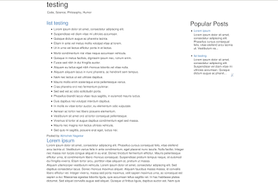
</body>The above code should look like this on any blogger blog.
The mobile site, I must say, would look horrible. Extra efforts are needed to make the template responsive. Since we already have Bootstrap, that is not a big deal either. I must conclude this post now, and for mobile friendly site, I may write an article soon. Also, there is no SEO in this template. You must add relevant <meta> tags to make your blog more search engine friendly. You can always override CSS rules of bootstrap by writing your own in the <b:skin> section.
Thank you for reading!